
Equality Fund Rebrand
The Equality Fund came to us with a big ask: How do you create a brand that feels bold, inclusive, and ready to lead the charge for global gender equity?
They needed something that could resonate with a diverse, worldwide audience while staying true to their innovative way of funding gender justice. It wasn’t just about a fresh coat of paint — this was about crafting a visual identity that could match their mission to drive real change and reflect their core values: collaboration, equity, and intersectionality.
Get
Get global feminists, equity advocates, and progressive changemakers…
Who
…who are fired up about dismantling systemic barriers and elevating marginalized voices but are looking for a platform that feels as bold and clear as their vision…
To
…to see the Equality Fund as the leader in global gender equity and rally behind their mission…
By
…by designing a brand that captures their intersectional, collaborative spirit and brings their values to life in a way that feels vibrant, powerful, and deeply human.

Here’s what we delivered:
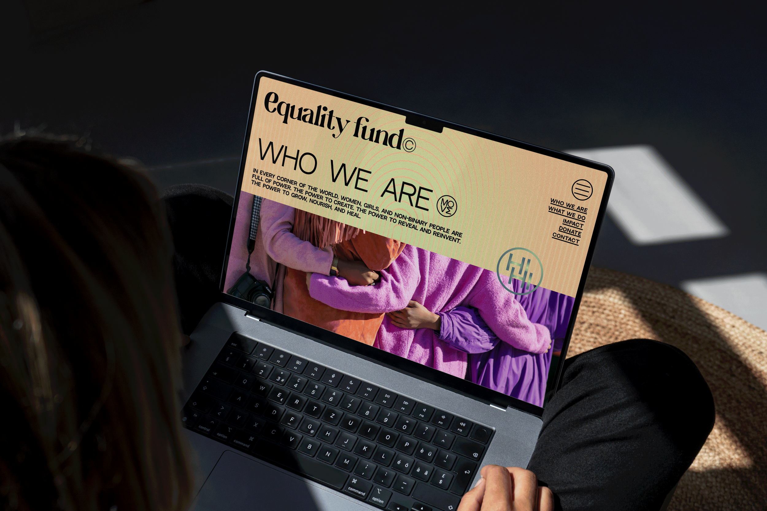
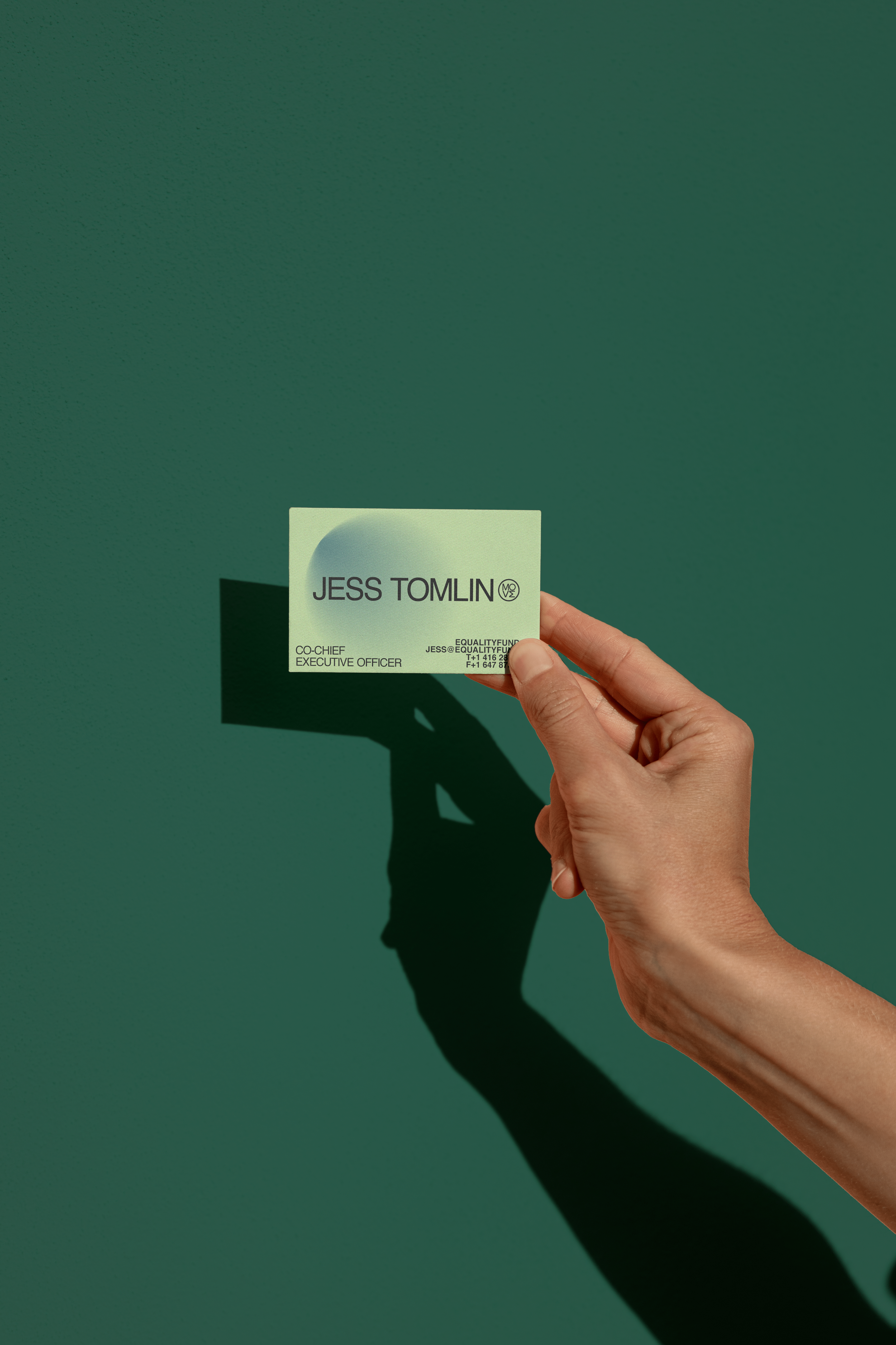
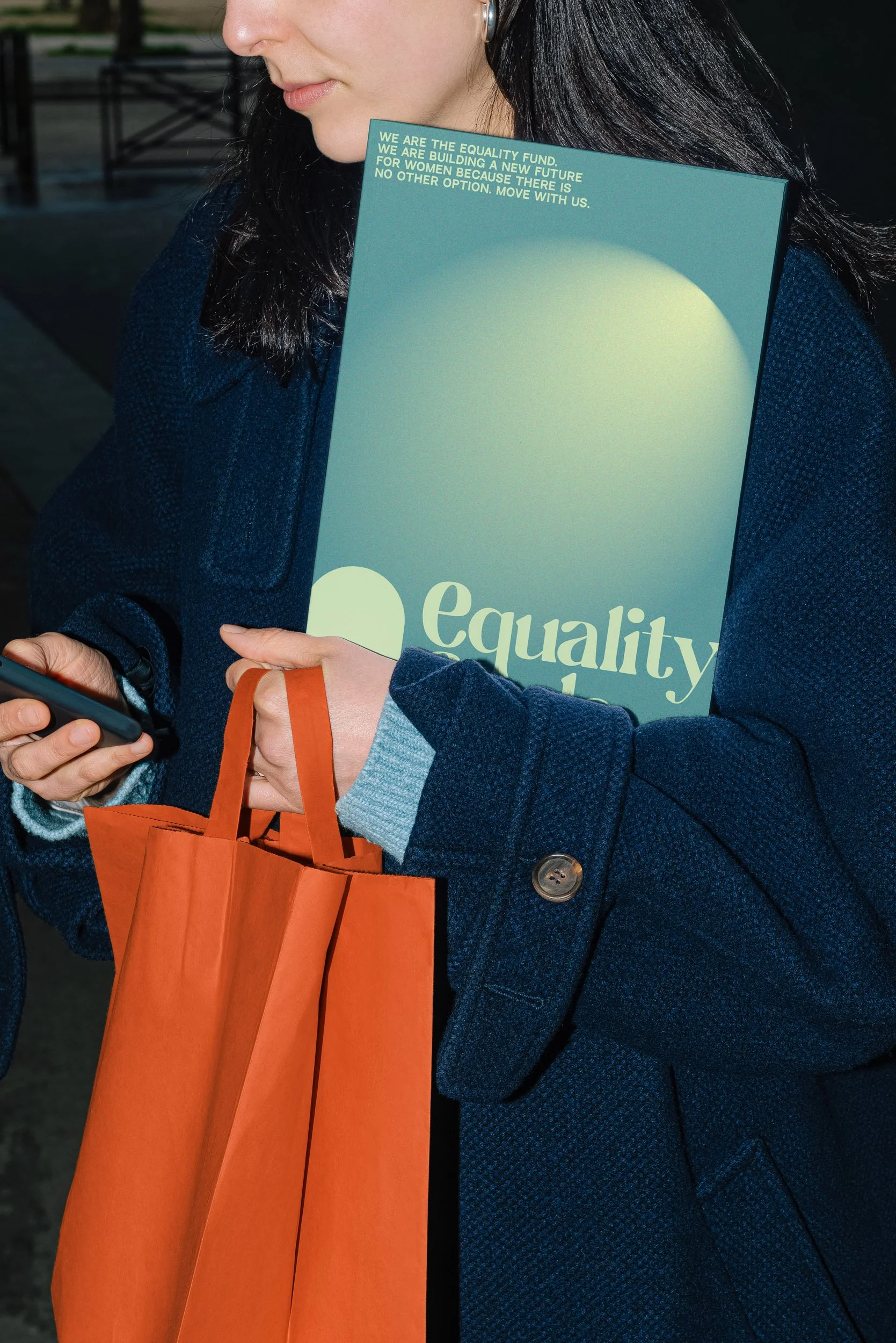
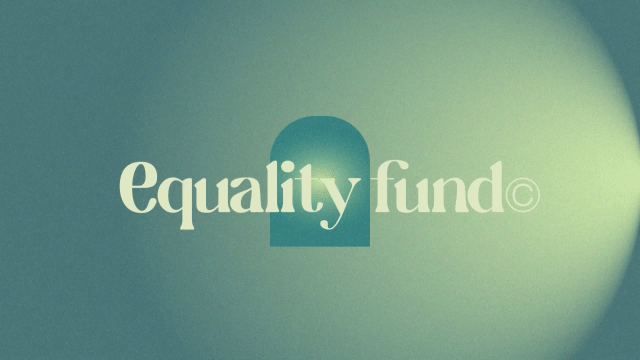
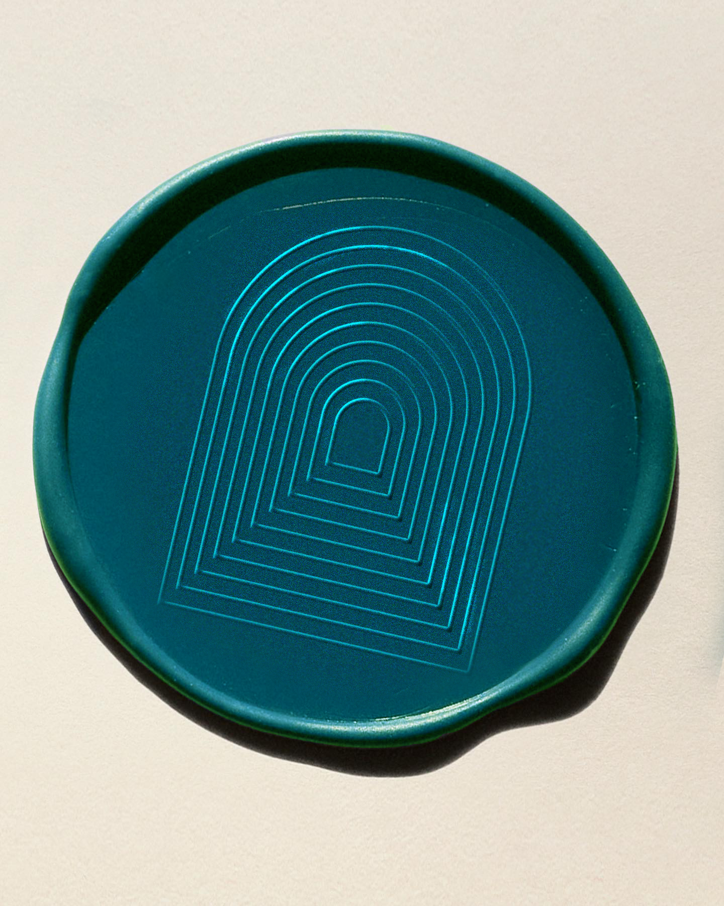
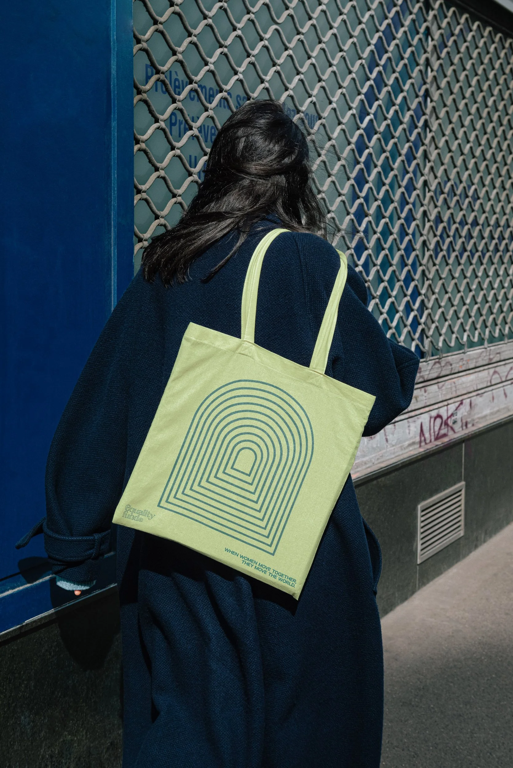
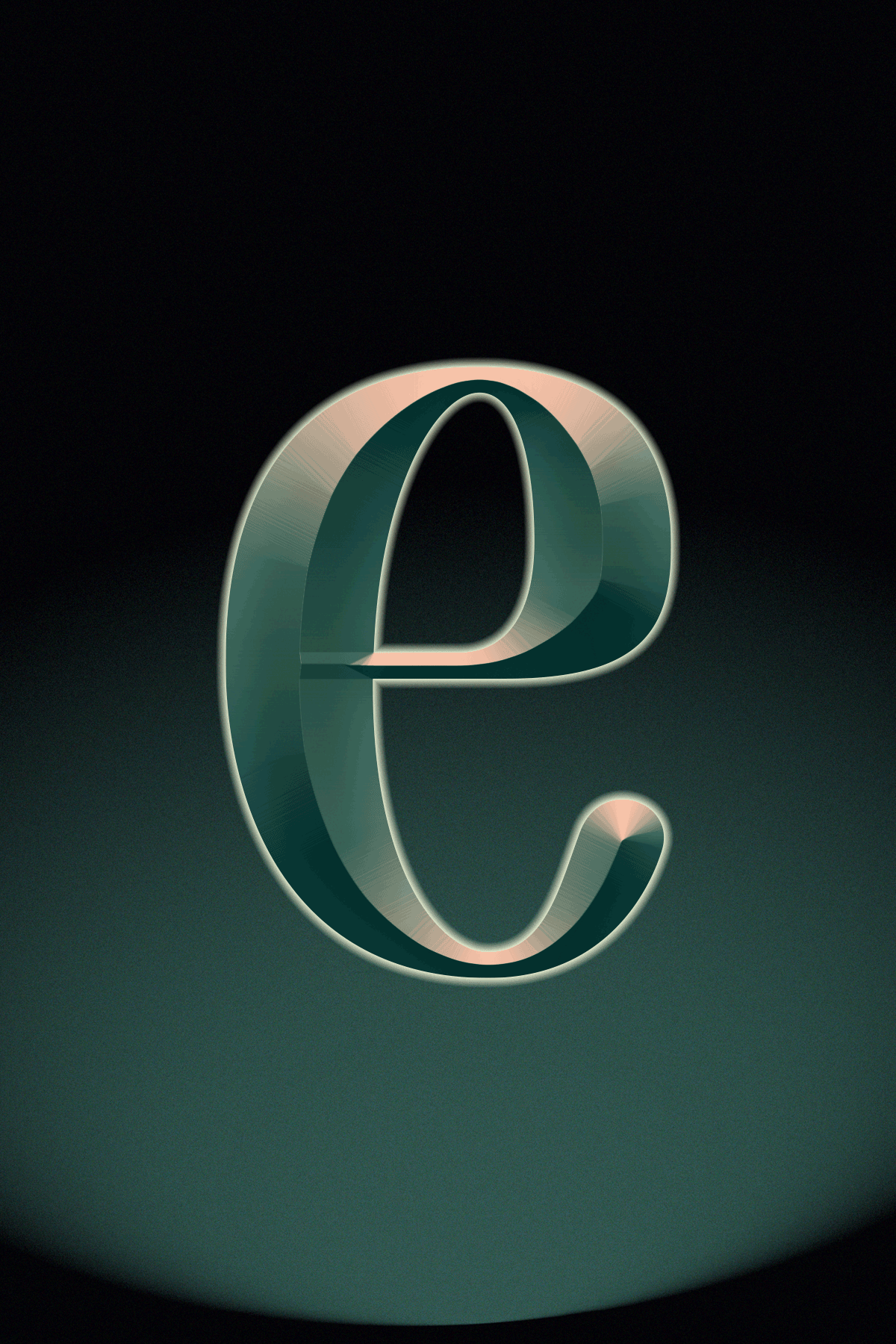
Logo Design: A modern yet timeless logo featuring the portal motif to represent growth and connection.
Color Palette: A vibrant, sophisticated mix that reflects energy and inclusivity.
Typography: Clean, powerful typefaces that balance authority with accessibility.
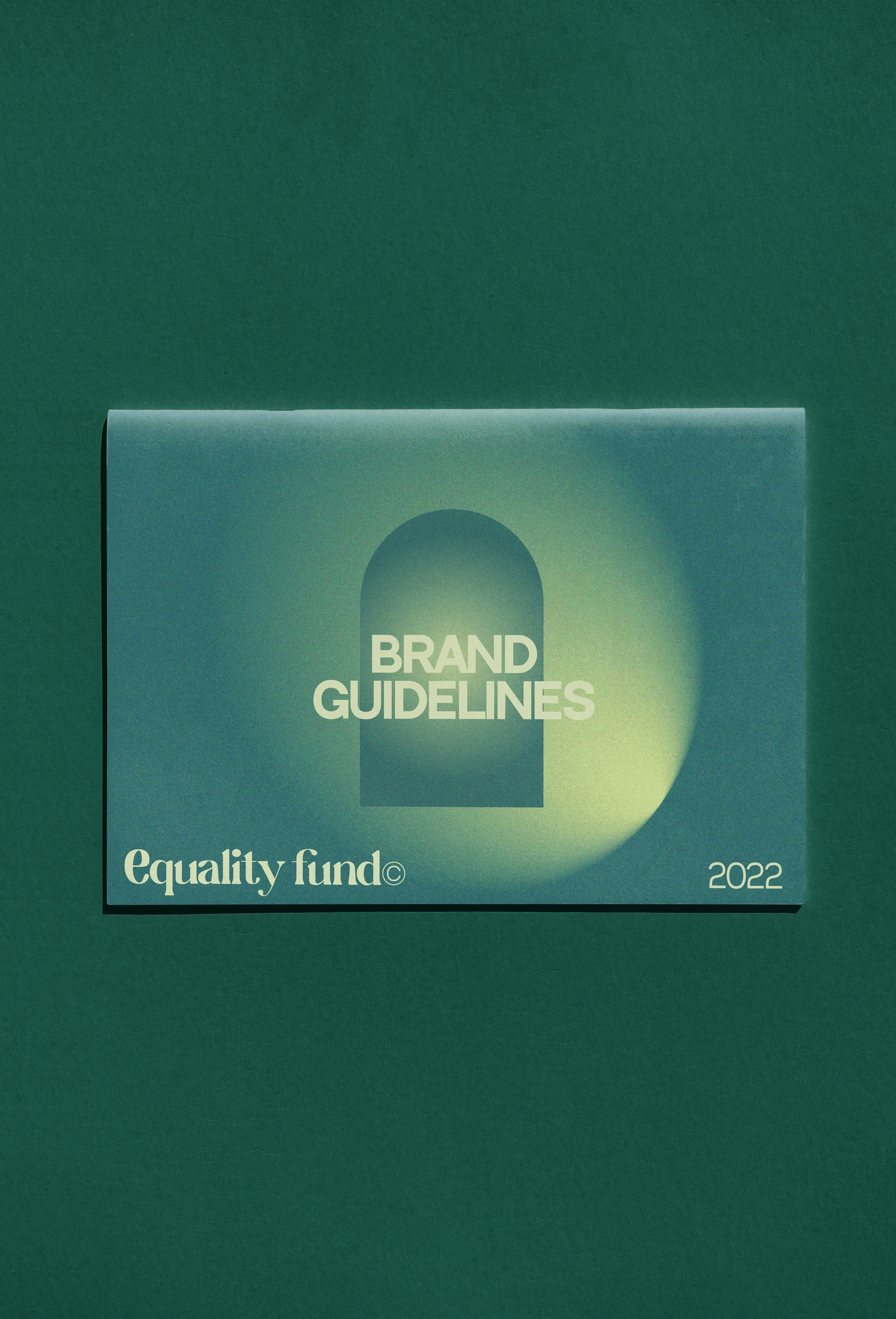
Applications: Flexible templates and assets for digital platforms, print materials, and events to keep the brand consistent everywhere.

The rebrand positioned the Equality Fund as a global leader in gender equity, amplifying their voice and reach. Stakeholders loved how clear and impactful the new identity felt, and it’s now woven seamlessly into their communications and campaigns. It was more than just a rebrand; it’s a visual representation of their values and their bold commitment to creating a more just, equitable world.

As a lead designer, I aimed to make the Equality Fund’s brand as dynamic as their work—more than a funder, they’re movement builders driving systemic change. Every design choice, from bold visuals to fine details, reflected their commitment to breaking barriers and uplifting marginalized voices.
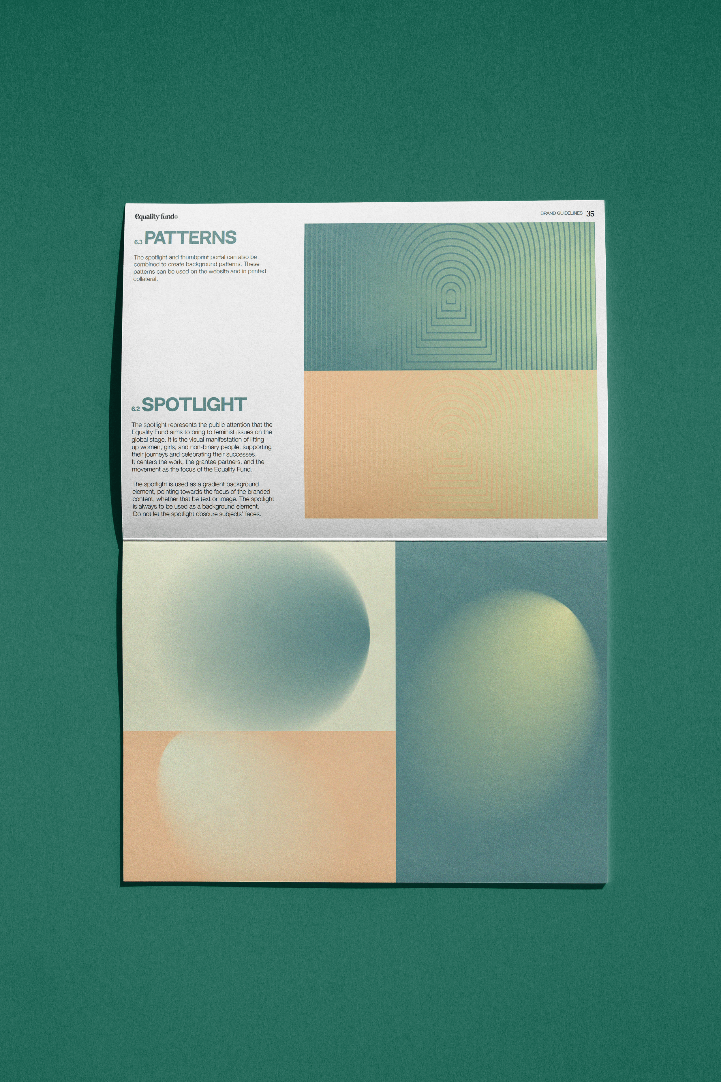
A key element of the brand that I’m proud of is the portal — a mix of solid shapes and open patterns that became the brand’s core iconography: symbolizing opportunity, progress, and interconnected pathways to gender equity.
This foundation shaped the rest of the visual language: bold typography, vibrant gradients, and interwoven forms, all designed to convey strength, movement, and unity — because this organization is here to make real change happen.

This project wasn’t just about aesthetics; it was about purpose. It was about designing a visual identity that could inspire action, rally support, and reflect the heart of the Equality Fund’s mission. Seeing our work help elevate such an important cause was a reminder of how intentional design can drive real, meaningful change.

EDIT THIS BLOCK TO CHANGE BACKGROUND COLOR
and image borders

